Sunday, March 30, 2008

NeoClassical Theme For WordPress

My favored theme for WordPress is the NeoClassical Theme developed by Chris Person. Not only do I like his use of white space and fonts, but my personal favorite is the header. Here's why.

Chris incorporated an easy to use random image header. The server load is low because the image is only updated once each time a page is loaded. There is no changing of the picture while you are trying to read.

More importantly, to update the header, simply download images labeled header_1.jpg, header_2.jpg, etc. into the images directory for the theme. Then we have to adjust one file random.php in the theme. We adjust the number of images and voila! We get random images on each web page of the site.

Note that the images should be 865 pixels wide by 180 pixels high. Black and white or color work fine. Thanks, Chris!
... Read More!

Don't forget to visit my photography web site where we sell museum quality black and white prints framed to last up to 175 years - Outdoor Images Fine Art.

Forcing Users to Login to a WordPress Site

WordPress is an increasingly more popular blog platform. Because it is so customizable and so robust, some want to sue it for an intranet or a more private workspace. I have one such site and I was looking for a way to force people to login before viewing the site. I had a hard time finding out how to make it work, so I have posted the answer here.

Previously, I was using WordPress 2.3 and found a post in an obscure place that had PHP code looking for cookies to determine whether a visitor was logged in. If they were not, then there was a redirect to the login page. All this code was added in the top of the file header.php so that it would execute first and redirect if needed.

After upgrading to WordPress 2.5, the code I was using to force a login to the site was no longer working. It gave an infinite loop in the redirection to the base page and I received an error instead of a web page. It appears to be from the code used to determine if a cookie was present on the system. When I removed the code, all worked normally.

The code below is adjusted to work with version 2.5 and will send all users without valid cookies to the login page. Note that I used the included function, is_user_logged_in().


< !-- *********** Added to force login before viewing -- >
< ?php
if (!is_user_logged_in()) {
nocache_headers();
wp_redirect(get_option('siteurl') . '/wp-login.php?redirect_to=' . urlencode($_SERVER['REQUEST_URI']));
exit();
}
? >
< !-- ********** End force login before viewing -- >


NOTE: Do not put spaces inbetween the <> characters. I included spaces here to properly show the code.

Let me know if you have other ideas.
... Read More!

Don't forget to visit my photography web site where we sell museum quality black and white prints framed to last up to 175 years - Outdoor Images Fine Art.

WordPress - Viewing a Single Post Gives a 404 Error

If accessing a single post gives a 404 error, then the error is most likely in the permalink structure. See the following instructions to fix the error.

In WordPress 2.5, sign in as an administrator and go to the Settings section and then Permalinks. Check the permalink structure in the custom section. The permalink structure should start with the following:


/index.php/xxxxxx


If the custom code starts with something else, change it to this. Making this change should allow the linking to work properly and should remove any 404 errors.

I had this problem when upgrading from version 2.3 to 2.5 and this was the fix.
... Read More!

Don't forget to visit my photography web site where we sell museum quality black and white prints framed to last up to 175 years - Outdoor Images Fine Art.

Working on Wordpress

I have been working the past week on a WordPress installation to house my photography. I have it working well now and have updated to version 2.5 which was just released this weekend.

I have several tips and suggestions to help with various steps in the upgrade and help getting photographs posted on your blog. I use Lightroom and several varieties of templates. I'll show you how in the next few blogs.
... Read More!

Don't forget to visit my photography web site where we sell museum quality black and white prints framed to last up to 175 years - Outdoor Images Fine Art.

Wednesday, March 26, 2008

The Turning Gate Galleries

The Turning Gate has created some fantastic galleries that easily install into Lightroom and make creating web site work much easier. Today we will look at the Auto Index template which automatically loads albums as they are published. This previously manual work has now been automated.

First, download the template and install it according to the directions from The Turning Gate. You can see an example of the template in action here.

This is an example used on my wordpress site. However, I had to modify the code somewhat. I use SUSE Linux 10.3 and apache 2.2.4 with the most current version of PHP. However, when I used the template without modification, I was getting the PHP code as the name of the album with no picture or other text shown.

The fix was relatively easy. Find the directory where you installed the template and edit the index.php file. Go down to the bottom where the html is being written in the div tags. Replace the following code:

<?=

with new code:

<?php echo

Be sure to put a semi-colon at the end of each item before the closing tag. See the following example for the complete code:

< div class="albumBox">
< div class="albumBoxContent">
< div class="albumThumb">
< img src='<?php echo $albums[$i]['thumbnail']; ?>' class="thumbImg" title='<?php echo $albums[$i]['title']; ?>' alt='<?php echo $albums[$i]['title']; ?>' />
</div>
< div class="albumDescription">
< p>< strong><?php echo $albums[$i]['title']; ?></strong>< /p>
< p><?php echo $albums[$i]['description']; ?></p>
</div>
< div class="albumLink">
< a href='<?php echo $albums[$i]['url']; ?>'>< span>Open Album</span></a>
</div>
</div>
</div>


That's all there is! Save the file and then restart Lightroom. After that change, the auto index template worked perfectly for me. I uploaded another album to a subdirectory from the auto index and following the rest of the directions from The Turning Gate, all worked perfectly!

Thanks TTG for a great set of templates!
... Read More!

Don't forget to visit my photography web site where we sell museum quality black and white prints framed to last up to 175 years - Outdoor Images Fine Art.

Monday, March 24, 2008

Extra Files When Editing??

I was working on some portraits I took of my boys in Lightroom and after I edited them using NeatImage to remove some grain noise, I found extra files. Here's what happened.

I had been using my standard workflow, scanning some freshly developed negatives, importing them into Lightroom and burning a CD for backup. After assigning some additional meta data and new keywords, I began comparing some of the frames to see which expressions I liked the most.

I narrowed my view down to four images and found one that I liked both the expression and the eyes. My next step was to try and reduce some of the grain in the negative. Simple, I thought, I'll use the menu item to edit with a third party program - NeatImage. Since I hadn't made any changes to the development of the image yet, I used the Edit Copy rather than the Edit Copy with Lightroom Adjustments option.

It took a moment, but then I have 46 megabyte files on a network raid array, so that is expected. After finishing and returning, the sort order had changed on my photos. I keep lightroom set to order by the filename since I don't have all the exposure metadata when using film over digital cameras.

After looking deeper, I found that I had created four copies of images - one each of the four I was comparing. They all had the -Edit extension added to the filename.

The lightbulb went off! Lesson Learned: When you have multiple images selected in Lightroom and choose to edit them in an external program, Lightroom will make copies of all the images even if the program you access doesn't open them all! This behavior is good and expected as Lightroom's power involves work on multiple images at the same time. We just have to be aware of it!

Conclusion

Since I have been using Lightroom now for four months, I checked and found many instances where I had more -Edit copies than I thought. Use the Library module and access the Metadata panel on the left. Select the File Type and choose Photoshop Document. You may be surprised at all the extra files you find! ... Read More!

Don't forget to visit my photography web site where we sell museum quality black and white prints framed to last up to 175 years - Outdoor Images Fine Art.

Wednesday, March 19, 2008

UPDATE FOR 2.5: Using SlideShowPro in WordPress

UPDATE for Wordpress 2.5 is at the bottom of this post.

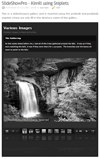
If you are looking for a way to put a SlideShowPro presentation in a WordPress web site, this tutorial is for you. See an example of this working below:

SlideShowPro is a fantastic plugin for Lightroom which provides the framework to effortlessly create gallaries and albums of your images. See the quick review we did of SlideShowPro.

After you create a web based gallary, you will want to publish it for others to view. We use WordPress for our own site. Like other web based packages, security updates have provided a challenge for creating script content that will be allowed to run.

WordPress Web Site Platform

WordPress is written to run in Apache and we use SuSe Linux as our platform for Apache. While WordPress was developed as a blogging platform, the ease of customizing the entire site lends WordPress the ability to host a good website as well. Considering my lack of PHP understanding and the wealth of administrative functions available through a web interface, WordPress is perfect for my uses.

At the time of this writing, the current version of WordPress, 2.3.3, does not easily allow scripts to run by itself because of enhanced security patches. While there are various plugins available to force html to remain as input for a post or call a library to run a flash presentation, I have had the best luck with the Kimili Flash Embed Plugin and below we discuss a method to ensure the SlideShowPro flash presentations will run well on WordPress. You can download the plugin here .

Placement of the SlideShowPro Gallery

SlideShowPro creates galleries and albums. It does not allow for customized headings, footers, links and buttons. Although SlideShowPro does allow you to add a logo or other graphic file and attach a link, we wanted to integrate our photos into a site seamlessly.

In order to keep the look and feel of our website, we have decided to place gallery showings in our posts and pages. This will allow our headings and menus to show right along with our images. This means we need to type some HTML code into the blog post or page in order to grab the presentation and show it in the browser with the rest of the site. The well written SlideShowPro manual provides us the steps to do this.

Requirements

In order to use our method to insert SlideShowPro results into WordPress, the following software is required:
  1. a working copy of WordPress
  2. the Kimili Flash Embed plugin for WordPress
  3. the Sniplets Plugin for WordPress
  4. Adobe Lightroom with SlideShowPro installed.

WordPress Preparation

First, install and activate both the Kimili and Sniplets plugins in WordPress. For instructions on how to install and activate WordPress plugins, see the WordPress web site on Managing Plugins. After activation, be sure you have created a SlideShowPro gallery or album and uploaded it to your WordPress site.

Our WordPress directory structure is as follows:
  • --www.domain.com
    • --wordPress
    • --pf (short for portfolios)
      • --slideshow1
      • --slideshow2
      • --slideshow25

While your directory structure may be different, you may need to adapt the path statements in these instructions to your setup.

SlideShowPro Adjustments

After preparing WordPress, we will adjust the SlideShowPro gallery that was uploaded to the web site. Per the SlideShowPro manual, inserting a SlideShowPro gallery in a web page is done in several steps:
  1. we have to copy the javascript library to the root directory of our web site.
  2. we have to place a piece of code in the head tag of the page that let's apache know where the javascript library will be.
  3. we have to insert the code to run the gallery in our web page.
We are going to substitute step three with placing the correct code in a post or page in WordPress to allow the flash presentation to show on screen. Below we perform the first two steps.

Copying the Javascript Library


If the root of your domain is www.domain.com, then create a directory called js (lowercase) and copy the file swfobject.js to this directory. This file can be found in the root directory of any slideshow you created with SlideShowPro and uploaded to your web site. Using our directory structure that would be Slideshow1 or Slideshow2.

Creating and Installing the Script Path Statement


The statement that needs added to the head section of each web page is as follows:

[script type="text/javascript" src="http://www.doamain.com/js/swfobject.js"][/script]

Note that the brackets in this code must be replaced with greater than and less than signs in typical html coding. Also note that this does not get added to the heading that shows up on the web site, but rather contained in between the head and /head tags. To do this in wordpress, we will use the Sniplets plugin. We will also use this plugin later on to view the slideshow. You can edit the theme of your WordPress site to include this code, but then changing themes will lose the scripting code. We chose Sniplets so that changing themes would continue to work.

Create a Sniplet with the script path code above. Call it anything you would like that will help you identify it later. I call mine SlideShowPro Lightroom Script for Themes in Header. Now set this Sniplet module to be put at the top of every page. This will put it at the top of the theme and even though it is outside the tags, it should work. If you have trouble with this, you can always edit your theme and add the code in the Heading.php file.

Creating the Post Containing a SlideShow

Now we are ready to add a SlideShowPro presentation to a post or page. Create a new page and title it Test of Flash Gallery. You can delete the post later after you are comfortable with how this works. We will be inputting code from the index.html page that SlideShowPro created per the SlideShowPro manual, but we reformat it to fit the syntax of the Kimili plugin.

Note that the SlideShowPro manual indicates we should find the index.html page within our presentation and open it for editing. There is very little code in the page, but there are two comments that indicate we should copy what is between those lines to move the presentation to another HTML page. See the image below.


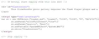
Find this code and copy it to a text file you can save for future reference or print it out to have it in front of you as we complete this tutorial.

Basically we will take this javascript code and put the same tags into the Kimili plugin format. By entering this code straight into our post or page, WordPress will run it through the plugin and the plugin will provide the presentation. Be sure you are using the html or code editor and not the WYSIWYG editor so that your code will be properly input.

First insert the html code with the paragraph tags and customize the text to indicate that Flash must be installed on the computer. This text will show only if the flash presentation cannot be seen. Then, input the code below to access the Kimili plugin and run the presentation.

[kml_flashembed movie="http://www.domain.com/pf/slideshow1/loader.swf" height="700" width="500" quality="best" bgcolor="#272727" fvars=" paramXMLPath = param.xml ; xmlDataPath = images.xml " base="." /]


Let's review each piece as it relates to your slideshow. Each of these tags represents one of the items created by SlideShowPro. Read the code you took out of your index.html from your presentation. Use that information to fill in your tags.

  • movie-this is the URL to the loader.swf file created by SlideShowPro. Use the complete URL as shown above.
  • height - the height in pixels (e.g. 400) or percentage (e.g. 100%) of the flash presentation.
  • width - the width in pixels (e.g. 400) or percentage (e.g. 100%) of the flash presentation.
  • quality - the quality assigned by SlideShowPro, leave as best
  • bgcolor - the background color as shown in the file by SlideShowPro
  • fvars - other variables needed by the presentation. See the Note below.
  • base - the base of the directories to access the files defined in the fvars tag. This should always be a dot or period.

VERY IMPORTANT: I got stuck on the tags and was only getting a black or grey box. The syntax of the tags used in the Kimili plugin does not seem to be picky except for the fvars tag. That particular tag must have the following convention:

fvars=" paramXMLPath = param.xml ; xmlDataPath = images.xml "

While it is difficult to show in this post, there must be spaces between each item within the quotes including the equals sign and the semi-colon. I do not know why, but without the spaces, the code on my machine would not execute. It may have something to do with parsing each item.

Finished!

That's it! Press the publish button for your post and view the site. Your presentation should be showing.

A few tips:
  • If you get a colored box in the post without the pictures, your tags need adjusted.
  • If you see a partial picture or the picture extends past the margins of your posting area, set the size smaller in SlideShowPro and regenerate the portfolio and ftp it to your site. You should not have to change anything else.
  • If you cannot see pictures, be sure you have the base tag included with a dot. This tells the presentation that the parameter and image files are in the same directory as the rest of the presentation.
  • For that matter, be sure all the tags above are included.
  • If you cannot see changes as you adjust your tags, check your caching in the web site. If you have any caching turned on in your web site, you may want to disable it until you have finished this tutorial. That way your changes will be immediately updated and you can view the results. You may turn on your caching after you are finished and happy with the results.
  • You can add additional text in the post prior to and after these tags and it will show seamlessly with the presentation

Using Sniplets

After I got the code for the Kimili tag working, I decided to try and make it easier to add in my posts and pages. I created two sniplets called PreSSP and PostSSP. In the first sniplet I copied all the code up to the name of my slideshow containted in the movie tag. In this case that was slideshow1. This included the slash before the slideshow. Then in the second sniplet I copied the code from the name of the slideshow until the end. Now we have our own custom HTML tags. You can easily add another slideshow to a post or page using the following code:

[sniplet PreSSP]slideshow25[sniplet PostSSP]

If you include the custom paragraph with the text indicating flash must be installed in your first tag, PreSSP, then the post will be complete.

Conclusion

It has taken me almost a week to figure this out. It is also possible that future releases of WordPress may break this functionality. As of this writing, version 2.5 of WordPress is in beta testing. I have not had a chance to test it yet. Let me know how this tutorial works for you and if you find any errors, let me know so I can fix them.

UPDATE: I am using version 2.5 of Wordpress now and the Sniplet plug-in does not let you edit or change the sniplets. You can use mySQL and edit the database directly. I have not seen an update to the Sniplet plugin yet, so I don't know if there will be one. I have also seen some security concerns regarding sniplets although I have tight directory security, so I don't know if I need to worry. HOWEVER, you do not need sniplets for SlideShowPro to work in Wordpress, it just made everything easier. ... Read More!

Don't forget to visit my photography web site where we sell museum quality black and white prints framed to last up to 175 years - Outdoor Images Fine Art.

Monday, March 17, 2008

SlideShowPro Plugin

I found a plugin for Adobe Lightroom that is a must have for anyone that wants to publish pictures on the web. The settings and capabilities of Adobe Lightroom are great, but this plugin takes it to the next level. Dominey Design has outdone themselves. See a preview from my website (under construction) showing SlideShowPro in action.


This is completely done in flash. More importantly, there are more settings than you can possibly imagine. You can choose all the colors, styles, what is showing or hidden, what data fields are used, custom sizes, hyperlinks, add logos, etc.

This control lets you toggle between full screen and normal sizing - on the fly. There is also an equally impressive gallery list that does not require much work to use. Also notice the wet floor look which can be toggled on and off. It maintains a reflection that changes with each image showing. This is truly well done.

The manual is very well written with examples showing how to use advanced features such as publishing within an existing web page and publishing multiple albums in a gallery window. Luckily, only a few items require extra work and they are not necessary to publish an album. There is also an extensive forum available to help with any questions or support.

All the ftp and export settings in Lightroom work, so you can publish your work straight to your website from within Lightroom.

You can buy SlideShowPro for Lightroom for only $25US and paypal is accepted with immediate download. If you want to try the plugin first, there is a great trial version that just stamps the pictures with a demo message, but is fully functional.

NOTE: As I get my website up and functional, I will a) post a link so you can view it and b) put together some tutorials for how to use SlideShowPro and how to customize it within the web framework.

Thank you Todd!
... Read More!

Don't forget to visit my photography web site where we sell museum quality black and white prints framed to last up to 175 years - Outdoor Images Fine Art.

Lightroom Update 1.4 Recalled

Adobe recalled their just released update to Lightroom version 1.4 and recommends rolling back to version 1.3.1. Read our article on the update recall and get information on how to rollback as well as the downloads.

We will post another link when Adobe releases the next update. Keep watching or setup a feed (see the options on the right to setup a feed to this blog).
... Read More!

Don't forget to visit my photography web site where we sell museum quality black and white prints framed to last up to 175 years - Outdoor Images Fine Art.

Friday, March 14, 2008

Identity Plate Known Bug in Lightroom 1.4

Adobe indicated that there is a known bug in Lightroom version 1.4 that affects the Identity Plate overlays in the printing module. We reproduce that bug below to show you how to fix it.

In the print module the Overlays section looks like the image to the left. Notice you can check the Indentity Plate box and the Render on every image box. This will cause the text or graphic to show on every picture selected to print. This is true for contact sheets and other forms of printing.

Now try to deselect ONLY the Identity Plate checkbox. Notice in the image below how the Render on every image checkbox is greyed out, but still checked. Also notice the identity plate is still visible in the image.


If you reselect the Identity Plate check box, deselect the Render on every image checkbox and then finally deselect the Indentity Plate checkbox again, you will end up with what is shown below. Notice the identity plate is no longer shown in the image.


Remember this is a known bug and Adobe should fix it in a future release. The good news is we know about it and we can fix it on our own.
... Read More!

Don't forget to visit my photography web site where we sell museum quality black and white prints framed to last up to 175 years - Outdoor Images Fine Art.

New Noise Reduction Feature in Lightroom 1.4 Update

Adobe didn't make many large enhancements to their just released Update to version 1.4 outside of continuing to enhance the compatibility of RAW cameras and updates in Adobe RAW (now version 4.4).

However, they did make one very welcomed change to those of us that like black and white photography and the difference is outstanding. Adobe added the ability to use the Color noise reduction when developing images converted from RGB to greyscale. Obviously the Color information still existed after the conversion to greyscale, but Lightroom 1.3 disabled that control and only allowed Luminance noise reduction.

The image below shows the result of making the Color noise reduction available. The left side shows version 1.3 in Lightroom which had 100% of the Luminance noise reduction applied. See how grainey the image still is (click on the image to see a larger version). The image on the right has had 80% of the Color noise reduction applied. The difference is so great that, without using third party tools, the color layer noise reduction can be reduced and larger prints can be made without unacceptable grainey patterns in the print.


Previously, I had to export the image to a separate noise reduction software package, reduce the noise and return to Lightroom. In the process, I lost the RAW image to use for black and white because it was converted to a TIFF for outside processing (always make a copy of an image prior to editing in a third party program, including photoshop).

Once again, thank you Adobe!
... Read More!

Don't forget to visit my photography web site where we sell museum quality black and white prints framed to last up to 175 years - Outdoor Images Fine Art.

Installing Lightroom 1.4 Update

The Adobe Lightroom Update to version 1.4 is here and available for download. The windows version is about 48 megabytes, which is the same as the full install. Perform these steps to upgrade your version of Lightroom.

  1. Download the Windows Update or the Mac Update and save it to your hard drive.
  2. Find the downloaded file and run the application.
  3. It will ask where to unpack the files.
  4. Accept the default location and after unpacking, it will ask if you want to run the installation.
  5. Be sure the run install checkbox is checked and continue. You will be asked what language to perform the install. English should be the default.
  6. Click Next to begin the actual installation process.
  7. Click begin to start the process (a little redundant).
  8. Accept the license to continue.
  9. Accept or change the location of the files to match your current installation.
  10. The installation will begin copying files.
  11. When the copying is finished, you will see a completed dialog box.
  12. If you leave the checkbox checked you can start lightroom directly by pressing the finish button. Otherwise start lightroom like you normally would and you will see the upgrade was successful.

That's all there is to it! ... Read More!

Don't forget to visit my photography web site where we sell museum quality black and white prints framed to last up to 175 years - Outdoor Images Fine Art.

Lightroom 1.4 Update Released (Recalled)

Update Recalled

Adobe has removed this update because of several bugs discovered after the release. Adobe suggests removing Lightroom version 1.4 and reinstalling version 1.3.1 until such time as the fixes are published.

Adobe's Lightroom Journal has all the details for the problems with this update as well as instructions on getting back to version 1.3.1.

Visit Visit the download page to obtain the full install for version 1.3.1 (win mac).

Uninstall Instructions

If you still have your 1.3.1 update which contains the entire program, then do the following to uninstall Lightroom 1.4 based on your operating system:

Mac: Delete the Lightroom application in the Application folder(Mac) and Delete the following file: Library/Receipts/Adobe Photoshop Lightroom.pkg

Windows: Choose the Uninstall Lightroom 1.4 menu item from the Windows start menu. The Add/Remove Program utility on Windows will also achieve the same result.

After I perform the uninstall and reinstall (windows), I'll let you know if there are any lost presets or problems. I would recommend a backup of all your user settings and your catalog prior to any updates or changes to your program.

Previous Post


Adobe made this update for windows available in Lightroom upgrading to version 1.4. The update page is here and the readme file is here.

The macintosh update is here.

According to Adobe this update adds support for more RAW formats and updates printer compatibility with Mac OS (Leapord):

The Adobe® Photoshop® Lightroom® 1.4 update includes these enhancements:

• Additional camera support for the Canon EOS 450D (Digital Rebel XSi/EOS Kiss X2), Nikon D60, Sony A350, and more
• Updated printer driver compatibility for Mac OS X v10.5 (Leopard)
... Read More!

Don't forget to visit my photography web site where we sell museum quality black and white prints framed to last up to 175 years - Outdoor Images Fine Art.

Printing in Lightroom using ICM with an Epson R2400

When you discuss printing in Adobe Lightroom you are liable to be met with a frown and an immediate discussion of how it doesn't work the way it should. There are many articles on the web and in publications that deal with printing. These articles give you step by step instructions with Lightroom and generic printers. Sometimes they even give you information on setting Epson printers.

After spending about four hours very late last night attempting to research the proper settings and match paper and ink to the screen, I have found the magic recipe for my printer. Thus, we will discuss the settings for the Epson R2400 to print in Adobe Lightroom using ICM. First, we will discuss the settings so that you can begin to print. Then, while your printer is working through the image, you can read about the research I did. Note that we will discuss black and white settings in another article as I have found those settings much more intuitive and easy to create.

First Things First - Prerequisites for ICM Printing


ICM stands for Image Color Management and uses what are known as ICC profiles. These are calibration profiles developed using standards from the International Color Consortium. For more information on these topics, follow the links provided.

In addition, your monitor must be calibrated. I use the i1Display2 by X-Rite also found as Gretag Macbeth Eye-One color management. The i1Display2 costs about $250US and will calibrate your monitor only - CRT, LCD and Laptop. There are many web sites where you can send a printout from your printer and have them create an ICC profile for you that I cannot justify more money for printing calibration hardware. This product is the best bang for your money.

You must also have ICC profiles for your printer and paper combination. Epson R2400 ICC profiles can be found on Epson's web site. Download these files and run them to extract the profiles to the proper place on your hard drive. Be sure to download the windows or macintosh versions appropriately.

Finally, your preparation includes being sure you have the most current printer driver. This is important to get new updates and my experience has been this is not done automatically. I purchased an Epson R2400 new in November of 2007. I used the CD included to install the driver. I have yet to receive a notice in windows indicating I have an update ready and I have not been successful determining the version of the software through any of the Epson control panels. That being said, I downloaded and installed the update from the web site and sure enough, it was a new version. The current driver for the Epson R2400 is also on their web site. Be sure once again to choose the appropriate operating system for your computer.

This completes our preparation. Open Lightroom and select an image for printing.

Lightroom Settings for Printing using ICM

Lightroom has a relatively simple interface for printing. Setting up the margins and print space in Lightroom goes beyond the scope of this article. We are dealing with only the printer settings. After setting the layout for an image, go to the bottom of the panel and view the Print Job Settings. Here is where we will tell Lightroom how to handle the color management for our image. Note that none of these selections alter what is viewed on the screen.

In order to print, we first set the Lightroom color management to Managed by Printer. This is a requirement. We will still use the ICC profiles, but we will select them through the printer setup.

Epson R2400 Printer Driver Settings

Next, press the Print Settings button to bring up the printer dialog. Press the Properties button to access the printer settings. In this example we are using 13x19 Velvet Fine Art paper. Set the paper type as shown in the image to the right.

Next, press the Advanced button if you are not already in the advanced mode.


These settings are extremely important. I have not found a reference to these settings in any print book or on the web. I think they are uniquely presented here.

When you open these settings, most of them are already set by default. If not already selected, select ICM color management. The mode should already be set to Driver ICM (Basic) as shown. In addition the intent should be set to Perceptual and the printer profile should be Epson Standard. Ignore the printer profile description for now as you cannot change it anyway.

Now select the check box for Show all profiles. This will enable all profiles on the computer to be available for selection. Use the drop down box under input profile and find ProPhoto RGB. This is the key to printing in Lightroom with the R2400.

Lightroom already uses this color space and although I have not been able to confirm it, if Lightroom is not managing the colors, it stands to reason that the ProPhoto RGB space is sent to the printer driver without manipulation. The results of my prints seem to confirm this is true.

After changing the input profile, the profile description at the bottom should match the ICC profile for the paper you have selected. In this case, our example shows the Velvet Fine Art paper correctly.

Using Print Preview in the Printer Driver Settings

While not required, I am trying to determine how accurate the Epson preview pane is. Thus, I have selected the checkbox for Print Preview. Many sources on the web have said not to trust this preview. However, it appears that the preview will tell you if what is being sent from Lightroom is close to what was on your calibrated (hopefully) monitor. It also appears through trial and error, that the preview will also show the modifications made by Lightroom if you chose to let Lightroom handle the color management. Thus, for now I trust it to show if I am in the right ballpark.

Saving the Preset Configuration in Lightroom

After making these changes, press the OK button on the printer driver dialog and then again on the printer settings dialog to return to Lightroom. Before doing anything else, save your settings as a preset. I have organized mine by paper type, then size of the print and then whether the print is matted or not. You can easily create folders, save a preset and drag it to your customized folder. These presets save the printer settings so they are important. Creating these settings is beyond the scope of this article and will be covered in a later article.

Press Print

We are now ready to press print! If you have made these changes, your print should come out very close to what is on your screen. This is provided of course you have setup your system and calibrated it correctly. I strongly recommend using the printer preview in the R2400 driver until you feel confident you have your settings correctly. While it may not be a perfect translation, the preview will tell you if you are way off the mark.

Research on Printing in Lightroom

After printing several prints using various settings where Lightroom whereby Lightroom controlled the color management, I gave up. The prints either had such bright saturation that Velvia film looked dark and pale, or the prints contained strong magenta hues. Yes, I had the printer set to ICM and No Color Management. I believe it has to do with the wide gamut of the ProPhotoRGB color space and mapping to the printer driver through Lightroom.

The method I presented above uses the default Lightroom color space and allows the Epson driver to manipulate it. This process has provided very acceptable results to me using the various Epson Fine Art papers. I have not experimented yet with the Luster paper and other vendor's papers, partly because I try not to switch often between matte and photo black cartridges due to ink waste.

Here are some of the sources I used to arrive at these conclusions:
If you review these many say to let Lightroom manage the color. A few forums suggest we should let Epson manage the color. However, no one suggests that we set the input profile to the same one as Lightroom uses.

Let me know your experiences. ... Read More!

Don't forget to visit my photography web site where we sell museum quality black and white prints framed to last up to 175 years - Outdoor Images Fine Art.

Wednesday, March 12, 2008

Selective Tonal Adjustments in Adobe Lightroom

Tonal adjustments are one of the most important tasks in photography. Before digital work it was slow and painful at best; photographers used various grades of paper and filters developing the picture to see the results one at a time. We are getting used to instant gratification with tools like Adobe Lightroom where we can see instantaneously the changes in tones we make to our images. Take a look at the image comparison below.


The photo on the left is without any tonal adjustments. I.e., the tonal curve is a straight diagonal line - no curves at all. The image on the right has a tonal curve that is adjusting the various shades of grey. I use a black and white image in this example because it is much easier to see the affects of changing tones.

Selecting the Proper Tool

In order to select a specific tone to modify, use the Tone Selection Tool that is in the tonal curve window. The image to the right is a picture of the little dot or bulls eye. You must click it to activate it. When activated, the tool shows two little arrows one pointing up and one down.

Selecting a Tone to Modify

After you activate the tool, the mouse cursor changes to the same arrowed bulls eye and a plus sign appears. Move the mouse over your image. Notice now in the tonal curve window a small bead or circle is moving up and down the tone line. This dot on the graph represents the tone underneath the plus sign of the mouse cursor.

Thus, select a tone that you wish to modify. It could be adding more detail in the highlights, bringing the highlights up and brighter, adjusting the contrast in a middle tone or shadow and various other tonal work that needs done. After selecting a tone, move the mouse up to lighten the tone and reduce the contrast or move the mouse down to darken the tone and increase the contrast.

As you slide the mouse up and down over a tone, notice the changes in the tonal curve. You must keep the mouse button pressed for the changes in the image and tonal curve to be shown. Releasing the mouse button sets the contrast and adjustments to that particular value. You will also notice that the area in the tonal curve near the selected tone (the bead on the line) will have a lighter area above and below the line. This is a natural area for the tonal curve to move in either up or down to represent the best tonal changes in a photograph. Lightroom is particularly smart in that you can see the range of values that are changed by moving the curve up and down.

Limitations and Possibilities

While Lightroom has improved the tonal curve significantly over that in use by Photoshop, there are some limitations compared to Photoshop. We will discuss these in detail in another article, but in simple form, Photoshop can have various lock points set along the curve and only the portion of the curve between the lock points will be adjusted. Lightroom has the ability to do this on a small and limited basis which we will also discuss in another article.

For now, you can adjust some various tones in your image changing both the contrast and the brightness of the tone. Try this using your image and select and hightlight area and then adjust a shadow area. The tonal adjustments made to image at the top of this article on the right are shown here. Notice that it represents a typical looking S-Curve. However, creating that curve was tailored to this specific image and took no knowledge of physics, light, logarithms or paper characteristics. It only took a visual cue that you wanted to change a specific tone in the image.

Checking for Clipping

Invariably, after making adjustments to highlights, shadows or a combination of tones near these extremes, clipping may occur in the image. Lightroom has a great feature that helps view clipping so it can be adjusted to your standards. Be sure to do this after any significant tonal adjustments. You can see here that after we made our adjustments to this image, only a minimal amount of highlight and shadow clipping ocurred.


Making Tonal Adjustments More Efficient

To be sure, adjusting tones in a group of photographs is probably the second most tedious work after removing dust and scratches (if you process negatives or slides rather than pure digital). This means that after you spend the time to create a good set of tonal adjustments to an image, you can save those adjustments as an Adobe preset. After saving, the preset is available to apply to another picture or a group of pictures. Simply open the picture for development and apply the preset. Finished! Wasn't that part easy? Once again, Lightroom developers sought to make image work less painful and more fun. Thanks, Adobe. ... Read More!

Don't forget to visit my photography web site where we sell museum quality black and white prints framed to last up to 175 years - Outdoor Images Fine Art.

The Mysterious Triangle in Adobe Lightroom


There is a mysterious triangle located in Lightroom just above the Previous and Reset buttons in the Develop module. See the picture to the left. As it turns out, the triangle is also above the Copy and Paste buttons in the same module. In fact, it appears above every pair of buttons in the various Lightroom modules.

I have seen blogs on the internet asking about this triangle. I almost called it the Bermuda Triangle of Adobe Lightroom except that it doesn't cause any mysterious loss of pictures or data. In fact, I don't believe it was the result of lost code or a beta leftover. I'll show you excactly what the triangle is for!

Study this picture and you will notice the triangle is no longer there. It has disappeared. No, this is not a fancy setting in the options section. The triangle is actually a user friendly tool that your eyes will get used to seeing if you look for it. Notice in this picture the tool bar above it has been scrolled such that the bottom of the tool bar is showing. I.e., there is no more hidden tool bar in the panel at the bottom. Thus, the little arrow is gone.

Now go look at the photo we started with. Notice how the toolbar is extended below and out of view. Thus, the little arrow tells us there is more to view.

Sorry, no mystery here. In fact, the little arrow isn't even developer's eye candy to spice up the interface. It is simply a little reminder that there is more to see and it is hidden from view.
... Read More!

Don't forget to visit my photography web site where we sell museum quality black and white prints framed to last up to 175 years - Outdoor Images Fine Art.

Tuesday, March 11, 2008

Insert Metadata in Images

Adobe Lightroom, like most image editing and management software, makes use of standardized data attached to the image. This data is called Metadata and represents items such as the camera, exposure values, dates shot, locations, copyright information, job information and a host of other data.

If you are not a professional freelancer a good portion of this data is probably not of value to you. However, some data should be input regardless of the type of photographer you are.

Types of Metadata to Input

For purposes here, there are three types of metadata to input. These are listed below with links to further articles about them.

  • General Data applying to any and all images - i.e., copyright notice and photographer name.

  • Image Location Data applying to all images taken in a certain location, date and / or time.

  • Image Specific Data applying to only one individual image - i.e., a title and caption for the image.


These articles also describe a workflow to integrate adding this metadata in the most efficient manner possible. ... Read More!

Don't forget to visit my photography web site where we sell museum quality black and white prints framed to last up to 175 years - Outdoor Images Fine Art.

Monday, March 10, 2008

Important Metadata to Apply in Lightroom

Certain metadata fields can be used later on in Adobe Lightroom. Inputing that data is easy if you select multiple images and add the metatdata in bulk. Let's look at some of the fields first and what they can be used for and then move to attaching data to the images.

Metadata Fields

Certain fields in the metadata can make further use of Adobe Lightroom extremely efficient. For example, the Title and Caption fields are used to describe the image. I use these fields only on my better images or those that have some special meaning to me. Once these two fields are filled in, creating a slideshow or web pages is greatly enhanced. The Title and Caption fields are user selectable items to show in these modes - see the image below.


Also notice the copyright tag on the photo. This comes directly from the copyright field in the metadata. If done properly, the copyright information is attached through a template during the importing of images. Keep this field short and sweet to properly show on the images.

The metadata fields are a great way to store information about your images. Other important fields are location information including city, state and country. This information can later be filtered and searched to display images meeting certain criteria.

Attaching Metadata

As with many of the data processes in Lightroom, attaching metadata to multiple images is very simple. Select the images that will share the same metadata either through location, title and caption or some other data to enter. You can select these by holding down the shift key and selecting a contiguous range or using the control key and clicking individual images.

Once selected, simply input the metadata. It will then be attached to all the images selected. Don't forget to de-select the images when you are finished so you don't accidentally perform an action on all the images at once.

Updating the Metadata in the Image File

Don't forget that adding metadata may cause your images to show the icon to the left. This indicates the images should be updated with the new data. Lightroom stores the data in it's database, but the metadata should really be written directly to the image when possible. Click on this icon and the metadata will be written to the image.

Conclusion

That's all there is to it! Once you have updated this metadata, using it on prints or other output is easy and efficient. It also maintains consistency between types of output - printing, slideshows and the web.
... Read More!

Don't forget to visit my photography web site where we sell museum quality black and white prints framed to last up to 175 years - Outdoor Images Fine Art.

Friday, March 7, 2008

Lightroom Tip#7 - Adjusting Clipped Images

Lightroom has a tremendous tool to easily see which areas of an image are clipped. Thankfully they have one each for hightlight clipping and shadow clipping. The tool adds bright colors in an area of the image to highlight the type of clipping. See the example below for an image with both shadow and highlight clipping.


Notice that the areas shown in solid blue are clipped shadows and the areas in solid red are clipped highlights. This is a black and white image, a color image would remain color and would still show solid blue and red.

To show either of these clipping tools on an image, click on the triangles above the histogram in the right side panel. The triangle on the left is for shadows and the triangle on the right for highlights. This is easy to remember because the left side of the histogram represents the shadow area and the right side highlights.

Notice that moving the exposure slider and other sliders will adjust what is clipped. Also note these changes are updated in real time on your image.
... Read More!

Don't forget to visit my photography web site where we sell museum quality black and white prints framed to last up to 175 years - Outdoor Images Fine Art.

Lightroom Tip #6 - Comparing An Image With Two Different Developments

In Lightroom, pressing the compare button or using the View, Before / After menu item, will compare the currently modified image with the import image. However, sometimes you would rather compare two different types of adjusted images.


The image above shows the standard before and after view. Notice how we have altered the image to show it in greyscale. Obviously, this comparison is fairly meaningless if you are trying to determine the best level for black and white tones. We would rather compare two adjusted black and white images. Let's discuss how to do this in Lightroom.

First, in the Development module make adjustments to an image that you are working on. Save that image as a snapshot. You can call it Image 1. Then adjust the image further, starting from the import snapshot if you wish or adjusting the previous settings further. Save that image as a snapshot calling it Image 2.

Now we have two images to compare. Select Image 1 and press the compare button, or use the menu item View, Before/After. You will see the images similar to the picture above. Now we have to move Image 1 to the place that the import is show, on the left side of the compare marked Before.

Press the middle before and after button showing a arrow moving from the right pane to the left pane. See the picture to the left. This will copy the After image to the left and now the same image is shown in both panes. Here is the trick. Now select the snapshot labled Image 2. It should appear on the right hand side in the After window and be compared to the Before window showing Image 1. See the picture below.


Now you can see the difference between images and select one to keep working on, or one to discard, whichever you wish.
... Read More!

Don't forget to visit my photography web site where we sell museum quality black and white prints framed to last up to 175 years - Outdoor Images Fine Art.

Thursday, March 6, 2008

Image Sharpening in Lightroom

Be sure to see the overview on Image Sharpening and resources on more information. This article discusses the sharpening tools available in Adobe Lightroom and how to use them effectively.

The sharpening tools are found on the Detail panel in the Developing module. You can see on the left they comprised of sliders labeled Amount, Radius, Detail and Masking. Each of these tools has a specific function towards gaining the sharpest image possible. Comparing these tools to the technique developed by Bruce Fraser, this is the content sharpening. The source sharpening, or first layer sharpening is encompassed in this content sharpening with Lightroom. Since Photoshop has layers, it can more easily separate source and content sharpening. Note that the final sharpening or print sharpening is done through the print module and covered in another article. Hence, we now move on to using these tools discussing each one in turn after briefly touching on the interface. We will discuss the Amount slider last as the direct effect on the image is dependent on the other three sliders.

Lightroom Sharpening Tools - Visual Sharpening At Last!

For those users of Photoshop, sharpening had these difficult to define terms. First there is the tool itself - the Unsharp Mask. Then there is this concept called Radius. How do these work together and what is the effect of the results? Enter Lightroom and although the same terms exist, we now have a visual aid to help us see the results, or at least better predict them.

A single most important step when using the Sharpening tools in Lightroom is to use the ALT key when moving the sliders for Radius, Detail and Masking. The ALT key will show a mask on the screen indicating where the effects of the Amount slider will be felt. The mask view generated by using the ALT key is the same as various layer views in Photoshop. The grey background in the Radius and Detail screens show the area unaffected by sharpening. For the Mask, the black area is unaffected. Thus it becomes easy to see which areas of a photo will be enhanced by the sharpening effect.

The Radius Slider

The radius slider indicates how large of an area around each pixel will be considered when performing the amount of sharpening selected in the Amount slider.

The larger the radius, the coarser the sharpening. Conversely, the smaller the radius the finer the sharpening. This means the larger the radius, the more the contrast. The image above shows a radius of 0.5 (the min) on the left and 3.0 (the max) on the right. Notice on the right hand image how the eyelashes show more contrast, but that the detail is also more lacking. In cases of fine detail levels, a higher radius loses some of those fine details. In cases of wider lines and smoother overall tones without fine details, a large radius may smooth those areas out and add contrast. Typcially, I use a radius value around 1.1 for my sharpening. To see the amount of the radius, press the ALT key and hold it while sliding the Radius slide back and forth. Remember the image must be in the 1:1 or more magnification. This is found on the upper left hand side of Navigator Panel.

The Detail Slider

The Detail slider shows how harsh the grain or pixels will show through on the final image, all based on the Amount slider of course.

The closer the Detail slider is to 100%, the more of the grain and pixels will show. The closer the Detail slider is to 0%, the less of the sharpening is applied to the area. The image above shows the Detail slider at 0% on the left and at 100% on the right. Notice that the image on the left appears soft and needs some sharpening, while the image on the right has brought back a lot of noise from the image. I typically use a Detail sharpening amout of somewhere near 25%.

The Mask Tool

The Mask tool determines the width of the area around the sharp edges that have sharpening applied. This means you can concentrate a high level of radius and detailed sharpening just around the edges of the image. This would leave the smooth toned areas without edges alone. Since a mask is in effect an overlay of where the sharpening can come through the image, a mask of 0% allows the sharpening affect to be applied to the entire image. Conversely, a mask of 100% allows the sharpening through only the brightest of highlights.

The image above shows a mask set to 25% shown with the ALT key held down. Notice that all around the eye, the pupil and the eyelashes is white, indicating the sharpening affect will blend through 100% based on the Amount, Radius and Detail slider positions. Also notice the sharpening will show through the left side of the face and the hair. This is based on the distinctly contrasty edges of the face and hair tones. Also notice the detail around the nose and the highlight on the right side of the face.

Notice in this image, where the Mask is set to 75% the lower amount of area where the sharpening will come through. The areas marked in white will allows 100% of the sharpening affects to come through; the black areas will be blocked 100% and only the original image will be seen in those areas. Notice the very thin lines around the eye and pupil as well as the eyebrow. Also notice the thin line on the left side of the face and hair. A considerable amount of detail has been removed from the mask allowing a more focused sharpening application. I use varying masks depending on the amount of fine detail in the image and the quality of the image. More often than not, I use a higher mask in the 65% to 85% range.

Applying the Tools

The order the sharpening tools are applied is important to estimate how the image will end up being sharpened. I start by moving the Amount slider to somewhere between 20 and 50 depending on how much sharpening I want to apply. Next, I set the Mask slider based on the image to show a reasonably wide width around the major edges. Next I set the Radius slider to 1.0 or 1.1 and move the Detail slider to somewhere near 20%. The Detail slider is last, so I use the feedback from holding down the ALT key to be sure I'm not adding too much noise back. I don't worry too much about noise in the soft toned areas as the mask should take them out. Finally, I zoom in and out to some detailed areas to see how they look.

Remember, too much sharpening is not good at this stage of the image processing. More sharpening will be applied at the print stage. Oversharpening in this content stage will only produce an overly contrasty print that has lost significant detail. It should look good on the screen, but not perfectly sharp.

Conclusion

These tools are essentially the same as the photoshop tools. The largest difference is that you can hold the ALT key and SEE how your sharpening will be applied. Choose the order that works for you to produce images sharpened to your liking. Also, don't forget to work with the preset modules and develop a set of developing presets that you typically apply to an image. This will make your workflow that much more efficient. ... Read More!

Don't forget to visit my photography web site where we sell museum quality black and white prints framed to last up to 175 years - Outdoor Images Fine Art.

Wednesday, March 5, 2008

Image Sharpening - A Reference and Tutorial

Image sharpening is one of the most important image enhancements in the digial world. This is especially true of scanned negatives or slides. However, the importance of sharpening is due to fuzzy images, but rather due to noise.

Noise Causes a Need for Sharpening

Noise is found in all digital images to some degree. Images shot in low light with high sensitivity set typically carry more noise than images shot in brighter light with lower sensitivity settings. Furthermore, all negative scans carry noise no matter what the speed of film and dots per inch scanned.

How does this noise cause sharpening problems? From both a digital and scanned negative perspective, the process of effective noise reduction causes the edges of an image to become softer. Removing noise in an image replaces pixels thought to be noise with a guess of the correct pixel color and luminance based on surrounding pixels. Thus, if an eyelash in a portrait has noise around it that is removed, some of the previously flesh toned pixels may actually now carry the eyelash color. I.e., the eyelash got a little wider than it was. In reality, the pixels probably carry a color in between the flesh and eyelash colors, causing a blurred efect.

Remove Noise, Add Sharpening - Why Do I Still Have Noise?

So we see that removing noise in an image causes the image to become softer. The next question is how we can add sharpening back, without causing the noise to reappear? If a sharpening algorithm looks at high contrast areas within an image and causes the pixels at either side to blend closer in color to the edges, doesn't that add some noise back? The answer is Yes.

This round robin of removing noise which blurs the image and then sharpening the image causing some more noise is what makes the image work flow so difficult. It also makes a successful noise reduction and sharpening workflow add significant value to your images.

An image that has noise removed and is extremely sharp is the type of image you see in advertising from printer manufacturers, film manufacturers, camera and software manufacturers. They all show this crisp, sharp and smooth toned print saying this is what you can do. They are correct, they just don't tell you how.

The Challenge Revealed

Now that we know what needs done, all that remains is to learn some techniques for accomplishing the workflow. I will leave you with several references here that I have found extremely in-deapth and useful. Following will be a list of topics we will explore over time here as it relates to sharpening and noise reduction. The good news is that once the technique is learned, you can easily replicate it with your images. Note that in order to achieve the best image, you will have to tweak the process for each image. However, understanding what happens will make that tweaking process relatively simple.

References


  • Bruce Fraser's book on Photoshop Sharpening - this book is by far the most detailed book on sharpening. More importantly, Bruce helps you design several sharpening routines that you can use in Photoshop over and over. I have created both Black & White as well as RGB sharpening routines based on Bruce's theories and practices - a great resource, thanks Bruce!

  • Neat Image Sharpening plug-in and stand-alone software - This software comes first for me because it has two great features - first, it works on black and white (greyscale) images as well as color and black and white is the majority of my work. Second, this program is both a Photoshop plug-in and a stand-alone software program. Thus, I use it directly in Photogshop and as an External Program in Lightroom. It also has a built in image that you can use to create noise removal profiles for your digiatl camera or scanner. I have had great success with the profiles for my Leica D-Lux3.

  • PhotoKit Sharpener by Pixel Genius - This program is produced in part by Bruce Fraser (see the book above) so it contains his workflow techniques. This is one reason I like this software so much. However, the drawback for me was that you are limited to a plug-in in photoshop and a 16-bit RGB image. No black and white (greyscale) images can be used. It is unfortunate, because this software actually leads you through a three step sharpening process - the source, image and printing. Kudos to Bruce again, and understanding his concept, I know it will be difficult to replicate for black and white, but I am sure the folks at Pixel Genius will find a way.

Sharpening Workflows

Why isn't Lightroom Listed?

Lightroom isn't listed here for the same reason Photoshop isn't. These programs have sharpening tools built in and the tools above can supplement them. However, I will review both my workflow and sharpening techniques for both Photoshop and Lightroom here. Keep looking for links that will take you to more practical information using the reference material above.
... Read More!

Don't forget to visit my photography web site where we sell museum quality black and white prints framed to last up to 175 years - Outdoor Images Fine Art.