Wednesday, January 30, 2008

Using Colors for Marking Images in Lightroom

There are three ways to mark images in Lightroom. Each method serves a different purpose and each method should be used in succession.

Using colors is the third method of three highly selective systems available in Lightroom to mark pictures for later selection. Using colors is best used as the last step in the image marking workflow. While flags determine if the image is worth saving, stars determine how good the image really is. Colors determine the status of the image before being released.

Colors can be used for any custom marking. I prefer to use color labels to let me know the edit status of the image and if it is ready to print or use in a slide show.

I left the descriptions very similar to the standard ones provided by Adobe to provide an easy transition. This will help explain the fact that the colors are not presented in the order of the workflow.

Some of the colors should be intuitive. Red means stop. Green means go. Thus, Red stands for a pending delete and Green stands for Good to Use, Corrected. I also use Purple for Good to Print and Yellow and Blue for touchups. Yellow means caution, needs Tonal Corrections. Typically the Blue layer in a color photo is where the noise is which needs removed to sharpen the image. Thus, the Blue color is used to indicate Retouching & Sharpening are Needed.

Why use a pending delete color when we have a rejected flag available for use? As you see in the referenced article, I use rejected for images that are clearly poor or accidental exposures. These I delete quickly. I also indicated that I pick images that look reasonable for further looks. This leaves some images that are not picked and some that may remain at a single star while others climb the rating ladder.

As I keep reviewing photos, I may have some severe duplication and want to slim down the image library. Since I've already backed all the images up, I may mark them to delete later and continue working. Every now and then I may review the images to delete and remove them from the library. The key is this: I am slow to remove images permanently from the library, so I want to review them for awhile to be sure.

This is why I use the Red color for deletion. Now, your next question might be why use Green as good and Purple as good to print. These two steps are mutually exclusive in my opinion.

Green indicates a picture has been fixed, retouched, sharpened, toned and generally set the way I invisioned the finished print. This means the image is ready for a slide show or to put on the web. However, printing is another story. Typically, you need additional fine tuned sharpening prior to printing. You may even need to adjust the tones slightly depending on the paper type being printed to. In Photoshop I even have separate layer groups for each type of paper I use. I can turn the layer on or off depending on what paper I am printing to. This allows me to set the tonal qualities different for the contrast range of each paper.

A Purple image in my workflow can either be a virtual copy specially setup for printing or a green image that I have tested and prints well the way it is. Think of purple as being backwards compatible. A purple image can also be used for slide shows and web pages. The image can also be used for printing.

Finally, I break out the retouching and sharpening because I may want to perform these functions, along with any noise removal, outside of Lightroom. Photoshop does a great job using layers for spot touchups. I also like Neat Image's Noise Removal Program which can be customized with a profile for your scanner or camera. Thus, I mark these images to know they may need work outside of Lightroom. Typically the tonal work can be done within Lightroom so I allow a separate color.

Conclusion

This concludes the three methods used to mark images in Lightroom. Each method is a step in the workflow process. Each step allows you to further define and refine your images. The extra marking ability provides a complete database that can easily be searched no matter how large it becomes. ... Read More!

Don't forget to visit my photography web site where we sell museum quality black and white prints framed to last up to 175 years - Outdoor Images Fine Art.

Using Pick Flags in Lightroom

There are three ways to mark images in Lightroom. Each method serves a different purpose and each method should be used in succession.

Using the pick flags is the first method of three highly selective systems available in Lightroom to mark pictures for later selection. Using pick flags is also the best first step in your workflow. The image below shows the three flags available to mark each image.
The flags represent, from left to right, Picked, Not Picked and Rejected. Thus, the flags should be used in the initial selection to determine the status of the image. We discuss each flag use below.

Rejected

Rejected flags are discussed first because they are the easiest to assign in the first pass of reviewing a set of images. Any image that is clearly out of focus, black because of a malfunction or lens cap or even an unexpected floor or ceiling shot should be marked as rejected. These are images you never have a prayer of using. These images in all likelihood will be deleted, although you will see we can treat rejected images in a variety of ways. To mark an image as rejected, press the 'X' key on your keyboard. The 'X' key is used because it is similar to the 'X' marking out the image on the flag.

Picked

After marking the rejects, the second pass of your image set should be looking for potential keepers. There are really two solid ways to approach using the pick flag.

If the image set is of a specific event, you may want to use the pick flag to sit down with your customer and choose images for later printing. Assuming you have already marked the rejects, you could filter the image set for only picked and not picked flags. Then using the picks your customer makes, you can create a web site, a cd presentation and prints. Finished.

Since my image sets are normally of a specific area or subject, I am looking to include them for sale in one of my portfolios. I use the pick flag to determine which images have potential to move up in the start rankings and eventually become part of a portfolio. At this stage, I am very loose with picks. Any image I do not pick is because I really do not find it interesting at all. In addition, if I have several shots of the same subject in the same position, I will compare them and pick a few for review. I do not normally limit my pick to only one image in a group at this point. There will be time later to refine the selection. We will discuss workflow in another article.

To select an image as picked, press the 'P' key on the keyboard.

Not Picked

By default, each image starts out with no flag, or not picked. When I am finished, my not picked images are ones that I am not ready to delete, but that I am not ready to include for further selection either. If you accidentally mark and image as rejected or picked and need to remove the flag, use the 'U' key on the keyboard to remove all flags.

Conclusion

Flags are an important part of the selection process. Start with flags when reviewing a set of images. Divide the images into a) certain rejects and b) possible good images. Leave the rest of the images not picked. You can always filter on the not picked images and change the flags later.

After setting flags, move on to rating the images using the star rating system. ... Read More!

Don't forget to visit my photography web site where we sell museum quality black and white prints framed to last up to 175 years - Outdoor Images Fine Art.

Tuesday, January 29, 2008

Star Ratings in Lightroom

There are three ways to mark images in Lightroom. Each method serves a different purpose and each method should be used in succession.

Star Ratings is the second method of three highly selective systems available in Lightroom to mark pictures for later selection. We will refer to Star Ratings simply as Ratings going forward.

Ratings in Lightroom range from zero stars through five stars and assigning a rating to an image is incredibly easy. The picture to the left shows zero stars. The dots indicate additional spaces available for assigning a higher rating.

Before we discuss how to assign the rating in Lightroom, we will discuss how to determine what rating to use. Think of your entire library of images as a giant pile of lottery tickets. Only one ticket is the ultimate winner and only a handful of tickets have smaller prizes. Most of the tickets win nothing.

Most of our images in the library should be good, but probably not great. Only a very few images are so outstanding that they deserve a five-star rating. Many images, therefore, should be rated zero stars to one star. If this is the result of our ratings, then finding great to superb images in our library is easy - filtering for four and five stars should not yield too many images to review.

Assigning Ratings Using Lightroom

That being said, how do we assign image ratings in lightroom. Two methods exist for assigning an image rating. First, the mouse can be used. Click on the number of stars below the image to assign that rating. Using the dots displayed for a selected image, the first dot to the left is a one-star rating. Clicking there assigns that rating and a star appears under the image. The second dot from the left is a two-star rating. Clicking there will adjust an image either up or down to that rating. As soon as the mouse clicks on the star place, the rating is changed. Saving the image is not necessary. Note that there is no way to assign a zero star rating to an image using the mouse.

The keyboard is also an easy way to assign images. Pressing the numbers zero through five on the keyboard will assign that number of stars to the image rating. Try selecting an image and pressing the four key on the keyboard. A brief notice appears and then fades indicating the rating is changed to four stars. Pressing the zero key will revert the image back to a zero star rating.

Note also that these commands apply to a group of selected images. All images in the group will be changed to a given rating. This is a good way to assign zero or one-star ratings.

Deteriming the Rating to Use

All images are imported with a zero star rating. I use a single star rating as a first pass for images that have potential. This can include duplicates.

I use a two-star rating to determine those images that I want to consider for further usage. It will probably still include some images that appear to be duplicates, but only if the subject matter is good and the technical aspects are good.

From there on out, only great images get higher ratings. I use a three star rating for images that have both excellent aesthetic qualities and technical qualities. These are later candidates for four and five star ratings.

Four star ratings include only those images that have perfect aesthetics, but maybe not perfect technical properties. This doesn't mean out of focus, this might mean that tones or lighting isn't exactly what I would have liked.

Five star ratings are incredibly difficult to obtain. I use a five star rating for the best I have ever taken. These images must be perfect aesthetically and technically.

From a portfolio perspective, certainly four and five-star images can be used. Using a three-star image is a matter of personal preference. We will have a later discussion on portfolio selection.

Selecting Four and Five Star Images

We are often our own worst enemy when it comes to selecting four and five star images. We love our own photography and have a hard time assigning a lesser rating to images. My only advice comes in two principals.

First, do not use any rating above a two-star rating without time passing from adding the image to your library. Print the image out and view it awhile first. Then determine if it has a three-star rating. Do not jump from two stars to four or five.

Second, let others help you select four and five star ratings. Move ratings up from three stars only if other people like the image. You can review the technical portion and some images use the rule of thirds well, but you can only really rely on the general public. Your family can help, but they too tend to be partial to your work.

Using a harsh criteria for rating images will ensure that when you need a truly great image, you will select one.

Filtering on Ratings

Filtering images using the ratings assigned is relatively simple. See the image below:


At the bottom of the library screen is a section labeled filters. Clicking on the number of stars will filter all images with that rating and above. Thus, in the image above, all images fitting the keyword or folder selections on screen will be filtered to three star ratings and above.

Conclusion

Ratings of images are important. However, just like praise, do not hand out high ratings too often or the ability of finding the best images will not exist. Be consistent, but be selective as well. ... Read More!

Don't forget to visit my photography web site where we sell museum quality black and white prints framed to last up to 175 years - Outdoor Images Fine Art.

Marking Pictures in Lightroom

The term Marking Pictures refers to the different methods of distinguishing pictures from each other. Traditional methods exist such as filename and title, but these methods only help to make an image unique among the other stored images. Metadata can also be used to provide location, country and source data to provide additional grouping. We talked about keyword assignment to considerably narrow down the focus of selected images.

However, none of these methods describe the QUALITY of the image. Sure, we can use keywords to describe quality such as 'favorite', 'nice', 'needs work', but this will only muddle up our keyword list and is difficult at best to remember. Three other methods of marking pictures are available in Lightroom: Flags, Star Ratings and Colors. We discuss each one individually and then put them together for a library workflow. ... Read More!

Don't forget to visit my photography web site where we sell museum quality black and white prints framed to last up to 175 years - Outdoor Images Fine Art.

Monday, January 28, 2008

Assigning Keywords Methods in Lightroom (1.3)

This is part of my Image Conversion Workflow.

Assigning good keywords in Adobe Lightroom is probably the single most important task to accomplish. Even after only cataloging 300 images, I would be lost trying to locate images without being able to use keywords.

I will address the organization of keywords in a later article. Today, I will address the different ways to assign keywords to an image. These methods are as follows:


  • Dragging images to the keyword
  • Dragging keywords to the image
  • Typing and editing the images's keyword list
  • Assigning keywords at import

  • Dragging Images to a Keyword


    Dragging photos to keywords or vice-versa is an easy method to use for assigning keywords. You can choose to assign a single image or multiple images to a keyword. To assign multiple images the same keyword use the or keys (PC) to select some images. Then, starting with the mouse cursor in the middle of the image, drag one of the images and drop it over the keyword you wish to assign. Note that the keyword list is on the left in the library view. The same is true if you want to only assign one image to a keyword. See the picture to the left showing a keyword highlighted to assign to an image.

    Dragging Keywords to Images


    The other method is to select one or more images, the same as in the previous paragraph. Then, click on a keyword and hold the mouse button down. Drag the keyword to the center of one of the images in the selection and let go. The mouse cursor should have a plus sign beside it like the picture to the left. If more than one image is selected, all the images receive the keyword assignment.

    Typing Keywords in the Keywording List


    The third method of assigning keywords is to type them directly into the keywording dialog box. You can add existing keywords or by typing a new word can create a new keyword on the fly. If you have keywords that are nested or have a hierarchy, which I highly recommend, then typing them in is a little different.

    Assume that you have a keyword called 'Deer' that is a member of the 'Animal' keyword group which is a member of the 'Nature' keyword group. The hierarchy is as follows: Nature -> Animals -> Deer. To type in this keyword, use the reverse hierarchy, as follows: Deer > Animals > Nature. This will allow the assignment of the layered keyword.

    Notice the keywording dialog box can also contain asterisks (*). This occurs if more than one image is selected and some of them contain different keywords. For example if you have a waterfall image selected and a image of some deer and the waterfall image contains the keyword 'Waterfall' while the deer image does not, then you will see the 'Waterfall' keyword followed by an asterisk '*' as follows: 'Waterfall*'.

    If you delete the asterisk, then the keyword is added to ALL pictures in the selection. This can be helpful if you have a group of pictures that should have the same keywords, but not all share the same keywords. Assign the keywords by removing the asterisks in the keywording box. Again, simply removing the asterisk from any keyword in the keywording box will assign that keyword to all images currently selected. The remaining keywords will stay as they are.

    Importing Images with Keywords Assigned

    Finally, importing images also presents an opportunity to add keywords. While keywording templates are beyond the scope of this article, templates offer an easy way to assign information used on a repetative basis to images as they are imported. Below you see the 'Import from Devices' dialog box. Notice the section at the bottom of the dialog.

    It has a blank allowing you to input keywords. All images being imported will be assigned these keywords. Once again, if the keyword does not exist, Lightroom will add it to the keyword library for you.

    Conclusion

    These are the methods for adding keywords to your images in Adobe Lightroom. Keywords are exactly that: key to finding your images. Even as a hobbyist, you will gain a large number of images and searching through them takes far more time than searching a database of keywords. Your savings will be directly related to the amount of forethought you put into designing your keyword structure.

    I will write some additional articles on keywords including the following: keyword templates, creating keyword hierarchies and the importance of multiple keywords for each image. ... Read More!

    Don't forget to visit my photography web site where we sell museum quality black and white prints framed to last up to 175 years - Outdoor Images Fine Art.

    Dragging Images in Adobe Lightroom (1.3)

    Keyword assignement in Adobe Lightroom can be tricky to new users. Sometimes dragging and dropping the pictures does not seem to work. The documentation on this problem is lacking.

    Fortunately, the solution is simple. See the picture to the left for an attempt at dragging the photo. Notice the arrow on the picture. If you hold down the mouse button and try to drag the photo, it doesn't seem to work.

    This is because the mouse is not directly over the image. The mouse is over the border. This behavior is not a design flaw or a bug in Lightroom, it is the intended outcome. Notice also on the frame of the picture all the different symbols. These symbols can be set to show in the preferences and frequently the mouse can perform actions on the symbols. Thus, the frame of the image is a poor place to try and drag from. The problem is - this is not well described in the manual.

    Notice in this picture, the hand that is grabbing the small image within the area of the actual photo. If you click in the photo, hold the mouse button and begin to drag, the photo will move with the mouse and you can assign keywords and perform other functions.

    Assigning keywords is very simple. See my other article on the different ways to Assign Keywords in Lightroom.
    ... Read More!

    Don't forget to visit my photography web site where we sell museum quality black and white prints framed to last up to 175 years - Outdoor Images Fine Art.

    Lightroom (1.3) vs. Bridge (CS3) - Photo Management

    Adobe Lightroom library manager is the manager that should have been included with Adobe Photoshop! Adobe Bridge is a glorified file explorer and does it's job well. However, anyone using either Photoshop at its $649 basic price tag or Lightroom at its far less $299 price tab will need disk storage (prices from adobe on 1/28/2007). Put simply, media files take up storage space. Both photographers and graphic designers need storage space.

    Why then do we need the library manager from Lightroom rather than Bridge? The library manager keeps a database of image information and small and mid-sized thumbnails of the acutal image. This library format means the image does NOT have to be on the local hard drive to be viewed and analyzed.

    Sure, you need access to the image to process it for output or even to print it. However, you can view your entire library of images, search for the images you want to consider using and then pull the image from a DVD, CD or another hard drive depending on where it has the final resting place.

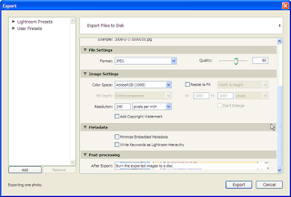
    As the image below shows, Lightroom Library will even export a selection of images and burn them to a CD or DVD burner for backup. What you cannot see below is that it will even ask for multiple disks until the entire set of images is saved.


    There is another advantage to Lightroom Library over Bridge. Most professionals have a larger computer with more memory and better processors and larger disk drives in their office. Then a good laptop is used in the field. This setup is the same as mine and Lightroom Library allows me to export my images to a catalog where I can further sort and grade my photos away from the office. Then I can bring them back to my workhorse desktop and import the changes. The image here shows my 30 gigabyte library exported with thumbnail images at only 277 megabytes. This screen shot is of my laptop where I am working on all the images away from my office.

    I can even add new photos to this copy of my library while I'm out in the field. I can import digital photos, adjust them, catogorize them and even put them in a portfolio ready to use. When I update my catalog in the office, these new photos are added along with the other changes. None of these unique abilities are available in Adobe Bridge.

    There are some great features about both Adobe Lightroom and Adobe Photoshop. I prefer to use them both depending on what I need to accomplish. However, I do all that I can in Lightroom first. It was truly made for photographers.

    A great book to get started in Lightroom and also detailed enough to develop your own workflow is titled, The Adobe Photoshop Lightroom Book by Martin Evening. This is a fantastic resource and I refer back to it frequently. Martin filled this book with step by step examples and changes in photos that you can see. I highly recommend it.
    ... Read More!

    Don't forget to visit my photography web site where we sell museum quality black and white prints framed to last up to 175 years - Outdoor Images Fine Art.

    Friday, January 25, 2008

    My Use of the Term 'Middle Gray'

    To keep things simple here, I will refer to the term Middle Gray (or Grey) throughout this Blog. When I refer to this term I am not trying to be scientific and represent a certain percentage of reflected light.

    I am merely referring to than greyscale tone that is exactly halfway between pure white and pure black. You might be able to refer to Middle Gray as Pure Gray.

    Please do not over-analyze my use of halfway either. I am not trying to distinguish between a logrithmic value halfway between two tones, nor am I trying to distinguish between the relative luminance of a tone between zero light and the brightest light source.

    Use the following image: take a strip of paper for each tone that can possibly be created between the colors black and white. This should be an infinite number of paper strips, but find the middle point and take that strip of paper. This tone is what I refer to as Middle Gray.
    ... Read More!

    Don't forget to visit my photography web site where we sell museum quality black and white prints framed to last up to 175 years - Outdoor Images Fine Art.

    What Is Middle Gray?

    Middle Gray? 18% Gray? 13% Gray? 12.5% Gray? What do we mean when we say middle gray? Middle Gray is this elusive concept that produces a tone exactly halfway between black and white. The question is why do we see so many references to different percentages of gray? Why isn't gray just plain ole' gray?

    Rather than try and produce the exact physics behind the measurements, I have decided to talk in general terms about grey and then reference the plethora of information already on the web about the physics and history. I am going to use middle gray instead of trying to reference 18%, 13% or 12.5% or whatever other percentages different people report. This will hopefully simplify our discussion.

    The Purpose of Middle Gray

    The purpose of middle gray is to give us a standard tone that is in between all highlights and all shadows. Light is measured in lumens, hence the word luminance to talk about the relative brightness of light. Most light meters measure the luminance of reflected light or light that has come from the source and bounced off of something.

    The luminance of reflected light is far different than the luminance of the source of the light. For example, you cannot look directly at the sun, the source of daylight. However, you can look at the sky, the ground, trees, etc. You also know that more or less light is reflected. If you look at a winshield and move to get the correct angle, the sunlight can be blinding. That means the winshield is reflecting near 100% of the source of the light.

    Measuring the luminance of reflected light is important because film or your digital sensor receives reflected light from your subject in order to take a picture. In a previous article we talked about the ease of obtaining an exposure using incident light instead of reflected light. However, our goal is really to obtain the correct exposure. The correct exposure to record a given subject is one that would render the tone of middle gray exactly as middle gray. [NOTE: please forgive the use of the term 'correct exposure'. From an artistic viewpoint the correct exposure may be one that darkens or lightens the subject compared to what we see. I am using this term scientifically for now, not artistically.]

    Using reflected light of a typical subject would produce an exposure value that would produce that subject as a middle tone. More often than not, the subject is not an exact middle tone. Recall that the incident light reading gives an exposure value that should produce the scene in the same tones you see it - darker in the shade and lighter in direct light. Thus, the incident reading takes into account the luminance of the source of the light and converts it to an exposure value for that elusive middle gray tone.

    So What?

    Ok, so what? Remember that most light meters measure reflective light. This means to obtain an exposure value we need to measure the reflected light from a middle gray source. Also remember that it can be difficult to determine exactly what source in the subject is supposed to be that middle gray tone. Enter a gray card.

    Holding a gray card in front of a subject and measuring the light reflected from the source to the camera gives an exposure value that will render the gray card with the middle gray tone. This gives us the key point of middle gray and the problem with what percentage of gray is the gray card.

    Key point: If the meter should produce an exposure value based to produce the middle gray tone on a given film and the exposure value is taken from the luminance of reflected light from a gray card, THEN the gray card, the meter and the film need to be coordinated to the exact same middle gray.

    Herein lies the problem. There is no standard that crosses the boundary of producing gray cards, manufacturing calibrated light meters and the responsiveness of silver compounds in film or digital sensors in a computer chip. There are standards for producing each item, but they are not in tandem.

    The Solution

    The solution is simply said but takes some effort to perfect. The solution is to perform the calibration of your gray card, with your meter in conjunction with each film you use. To be entirely complete, you would also want to calibrate your development process with each film. I will address the methods to calibrate these items in later posts and then link them here.

    Other Scientific Discussions of Percentage Gray

  • Thread on changing measured exposure from Kodak gray cards

  • Richard Hess discusses the problems with 18% gray

  • Luminous Landscapes discusses a computer value for grey

  • Wikipedia's definition of gray

  • ... Read More!

    Don't forget to visit my photography web site where we sell museum quality black and white prints framed to last up to 175 years - Outdoor Images Fine Art.

    Thursday, January 24, 2008

    Gray or Grey?

    My spelling has never been great, but then the English language doesn't always have consistent rules either. As I continue to write about black and white photography, I have to reference the color gray (grey?). The questions is: how should I spell it?

    The researcher in me took over and I decided to consult Webster. As it turns out, both spellings are acceptable and both spellings mean the same thing - the color. However, the roots come from different places.

    Gray is American English. Grey is British English. I haven't yet found a source that tells me when it changed from an 'e' to an 'a', but I surmise it had something to do with wanting to be different from the Mother Country back when we decided to be independent.

    As far as my blogs go, I will use either spelling, but I lean towards using the British spelling. I make no promises that I will be consistent, but at least now we know where the variations came from!
    ... Read More!

    Don't forget to visit my photography web site where we sell museum quality black and white prints framed to last up to 175 years - Outdoor Images Fine Art.

    Wednesday, January 23, 2008

    Exposure Basics

    The Exposure of a photograph determines several key aspects of the photograph:

    a) is the photograph exposed well enough to keep
    b) what is the mood of the photograph

    The first item is paramount to good photography. A great composition with a lousy exposure means the photograph is no good. The second item is more artistic than technical and with today's computer software, can be adjusted to some degree after taking the photograph.

    The topic here is to discuss ways of avoiding such a poor exposure that the photograph must be discarded. Future articles will discuss items such as calibrating your light meter, the contrast range of different films and exposure compensation.

    Basic Exposure Defined

    Fortunately, the technical aspect of exposure is quite simple. An exposure, defined in terms of an f-stop and a shutter speed for a given film speed, gives you a measurement to produce an exact 18% grey for your image. As an example, let's assume you have measured an exposure against a bright white wall. That exposure will give you a print that shows a grey wall halfway between black and white. As another example, assume you have measured an exposure against a dark black wall. That exposure will give you the same print - a grey wall halfway between black and white.

    Thus the first rule of basic exposure: Your measurement always gives you 18% grey, halfway between black and white.

    In the examples above, however, we did not want a grey wall. We wanted either a white wall or a black wall. How do we do this? We need to adjust the exposure in order to obtain a white or black wall. More about adjusting exposures later; most pictures we start out with are not a solid shade of any color, but various colors and subjects.

    Two Methods of Measuring

    The two methods of measuring light are:

    a) incident
    b) reflective

    These sound like big terms, but they are really simple. If you point your light meter directly at a subject, your are taking an exposure of the light reflected from the subject. If you point your light meter towards your camera, it is incident.

    All light meters built into cameras are reflective. You always point your camera at the subject and measure the reflected light. If you have a hand-held meter with a small white 1/2 sphere on it, that is for incident light.

    Measuring Incident Light

    By far, the easiest measurement for an exposure is using an incident light meter. Unfortunately, most beginning photographers only have the meter in their camera. You will see shortly that a spot meter is also invaluable for taking your photography to the next step. Because there is always a cost to buying equipment, you must make the decision of how much to spend and what value it can add to your photography.

    Let's go back to the white and black walls. If you take an incident light meter and stand in front of the white wall pointing the meter away from the wall and back toward the camera, you will get an exposure. The white dome over the light sensor filters out most of the light reaching the subject to provide an exposure. This is precalibrated to provide the level of lighting and contrast present in the scene as your eyes see it.

    Because the light being measured is coming from the source, e.g., the sun, and not being reflected off the wall, your reading will be the same whether or not a white wall or a black wall is behind you. In general, you would get a white wall or a a black wall in your photograph using that exposure. However, if the white wall is in the shade, then what your eyes see is a slightly grey wall, not white. This means, the incident light reading will give you an exposure for a slightly grey wall, not bright white.

    The second rule of basic exposure: An incident light reading will give you an exposure to show you what your eyes see which is not always what you want to see.

    What about backlighting? When the source of the light is behind the subject, and the subject is in the shade, an incident light reading cannot be used. Let's go back to the wall. If the sun is setting just behind the wall and you point your light meter back towards the camera, that little white dome is completely in the shade. The exposure given on the meter will grossly over expose the scene. Instead you must use a reflective reading.

    The third rule of basic exposure: An incident light reading can be taken in just about every situation EXCEPT for subjects with the light source directly behind them.

    Measuring Reflective Light

    Reflective light can be read using the following types of meters:

    a) wide view averaging meters, like in a camera
    b) spot meters with very narrow views

    Most camera meters have a simple averaging mode that gives an exposure based on the entire subject in the viewfinder. Some cameras also have a spot mode that is listed. Frequently this spot mode is a 7 degree view. This means you can hold your arms straight out in front of you and spread them apart 7 degrees. Whatever you see between them is where the exposure is determined. While 7 degrees is much better than an average of the entire scene, a real spot meter measures between 1 and 2 degrees.

    Using an average exposure may or may not work. It depends on the scene. We saw in the beginning that a white or black wall would trick the meter. The result would be a photograph that showed a grey wall and not a white or black wall. How then do we use an averaging meter to get the proper exposure? You have to find the right tones in your picture in a large enough area to give a proper reading.

    It turns out that several colors have the proper wavelength to provide an 18% grey needed to get a proper exposure. Medium shades of the following colors provide this reflectivity:

    a) red
    b) green
    c) blue

    I remember this by using the letters RGB, just like a computer monitor - Red, Green, Blue. The important point is that the shade of red green or blue not be dark or light. Bright is ok, but not dark or light. For example, maroon and pink are not red. However, a bright red fire engine is red.

    The fourth rule of basic exposure: Use middle shades of red, green and blue (RGB) to get a proper reflective exposure.

    How do you find these shades of red, green and blue? Easy! A typical bright blue sky is a good blue for reading an exposure. A front lawn of green grass is a good green to use as well as general foliage. Red? Red can occur in many man made items: brick, fire engines, British telephone booths, stop signs, clothing, paint, etc.

    Measure on a large area of green grass and recompose your picture using that exposure. You should be very close. Measure on a large area of sky right behind a subject, provided the sun isn't shining in your camera [NOTE: NEVER point your camera at the sun, especially if you are looking through it. Not only can it damage your camera, but it can also permanently damage your eyesight], recompose and shoot.

    Another method is to measure a typical, average skin tone. A face, a hand, a back can all provide a good basis for an exposure. Make sure the skin tone is in the light source you are using and not in the shade. Also, remember that an average skin tone is one stop lighter than 18% grey. This means that your meter will give you a reading that makes the skin grey and you want it one stop lighter. Either open up your lens one stop from the exposure, or slow down the shutter speed one stop from the exposure. Letting in more light will make the skin lighter than 18% grey and your exposure should be right.

    The fifth rule of basic exposure: You can use an average skin tone in the light source of your photograph and open up one stop from the reflected meter reading.

    Using A Spot Meter


    The advantage of a spot meter is limiting the area your meter uses to obtain an exposure value - a face in a crowd, a small patch of color. The large area averaging meter may not be able to focus on the area you want to get an exposure reading from. Other areas in the scene may adjust the exposure value from what it should be. A spot meter gets rid of that potential for error and quickly allows for an exposure reading on a small part of the picture.

    This can become especially important when determining an exposure on a subject with backlighting. You first need to determine what part of the scene should be 18% grey and then use the spot meter to obtain an exposure value. While this concept is more advanced and I will address it in a future article, the basics steps are few. The hard part comes in the first step and that can only be learned through trial and error.

    The first step is finding what area of the scene should be rendered 18% grey. If we use our color chart above, then we know red, green and blue would provide that value for us. If you use a sunset as an example, find an area off to the side of the sunset with either a) red clouds and sky or b) 18% grey clouds. Use the spot meter to measure an exposure and shoot away.

    Conclusion

    Exposure is tricky and nothing beats practice. An incident light meter is not a piece of equipment that most beginning photographers have, but is the easiest to use and get a great exposure. A spot metering system will greatly enhance your ability to get a proper exposure in odd lighting situations. My personal goal is to get a great exposure the first time and not have to waste film bracketing all over the place. Software can help adjust exposures, but nothing takes the place of getting a great exposure in the camera to start with.

    My favorite source for learning about exposures is a great book by Jim Zuckerman, Perfect Exposure: Jim Zuckerman's Secrets to Great Photographs. I highly recommend picking up a copy, reading it, re-reading it and practicing it. I even go back and take notes on 3x5 index cards to take in the field until it becomes habit. Zuckerman's philosophy is to get the exposure perfect the first time and not bracket except in very special situations. In addition, this book has a very high volume of example pictures showing where Zuckerman took his measure and whether he used average reflecting, spot reflecting or incident light measurements. It really is a great book. ... Read More!

    Don't forget to visit my photography web site where we sell museum quality black and white prints framed to last up to 175 years - Outdoor Images Fine Art.

    Wednesday, January 16, 2008

    Choosing A Print


    Choosing a print involves determining if you want a frame, picking a size and then determining if you want a signed, limited edition print.  The following steps will help you pick the best print to hang in your home or office, or give as a gift.


    Framed or Unframed?


    If you have experience framing prints or would like a custom frame other than what we offer, order a print without a frame.  These are labeled Unframed in the categories.  If you want the framing taken care of for you or you like our special museum quality archival frames, then order a framed print.  These are labeld Framed in the categories.


    Note that framing your own print must be done in a certain way to maximize the archival life of the print.  See the framing guide at the bottom of this page.


    After choosing framed or unframed, choose a size to purchase.


    What Size Print Should I Choose?


    We sell all our prints in framed or unframed sizes.  All sizes are expressed in inches.  The unframed sizes are as follows:


      • 11 x 14 inches

      • 13 x 19 inches

    These print sizes are all printed on 13 x 19 paper and will fit in standard 16 x 20 or 20 x 24 frame with no further modifications.


    The framed sizes are as follows:


      • 11 x 14 frame with 8 x 10 inch print

      • 16 x 20 frame with 11 x 14 inch print

      • 20 x 24 frame with 13 x 19 inch print

    NOTE:  The 8 x 10 inch prints only come framed.


    Choosing a Limited Edition Signed Print


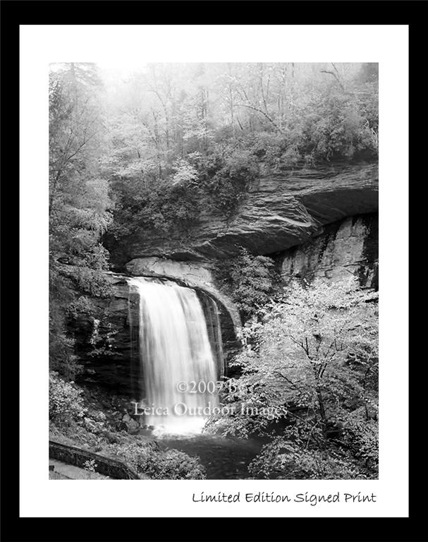
    These prints are exactly what they imply.  We have certain images we have set aside for signing and numbering.  In all cases these prints will be limited to 500 numbered editions signed by the photographer.  Each print will be numbered # of 500.  Once these are gone, there will not be another issuance of this limited edition print!


    Limited Edition Signed Prints are only available in a 20 x 24 frame containing a 13 x 19 print.


    Picking an Image


    After you determine the size of the print you want and whether you want a Limited Edition Signed Print,  you can browse the pictures available.  Use the categories on the left to select the size and framing of the print.  You will be taken to a list of the prints available.


    Select a topic to help you narrow down which image you would like to purchase.  You can also search for a keyword using the search function also on the navigation bar to the left.


    Purchase the Print!


    After you have customized your print and found the best image, press the Buy Now button to have your print made and sent to you!  It really is that simple to own a museum quality fine art print!


    QUESTION:  When will I receive my print?


    Shipping times vary depending on whether you purchase an unframed or framed print.  All shipping is done after receipt of payment.  Please allow 5 to 7 days to receive an unframed print and 7 to 9 days to receive a framed print.  Because we use archival materials it will take 3 to 5 days to hand make your print and hand frame it for the best archival life.  We use UPS and US Postal Priority Mail and insure all items.  See the shipping details for more information.

    ... Read More!

    Don't forget to visit my photography web site where we sell museum quality black and white prints framed to last up to 175 years - Outdoor Images Fine Art.

    11x14 Prints

    We sell a variety of 11x14 fine art prints.
    ... Read More!

    Don't forget to visit my photography web site where we sell museum quality black and white prints framed to last up to 175 years - Outdoor Images Fine Art.

    13x19 Prints

    We sell a variety of 13x19 fine art prints.
    ... Read More!

    Don't forget to visit my photography web site where we sell museum quality black and white prints framed to last up to 175 years - Outdoor Images Fine Art.

    8x10 Prints

    We sell a variety of 8x10 fine art prints.
    ... Read More!

    Don't forget to visit my photography web site where we sell museum quality black and white prints framed to last up to 175 years - Outdoor Images Fine Art.

    Limited Edition Prints

    We sell a variety of Limited Edition fine art prints.
    ... Read More!

    Don't forget to visit my photography web site where we sell museum quality black and white prints framed to last up to 175 years - Outdoor Images Fine Art.

    Archival Framing

    The second component of our process to provide you with Museum Quality Fine Art is using Special Framing Materials. All of our frames are black and all of our mat boards are white. The black aluminum frame is hand assembled remaining strong and light to avoid warping on larger sizes.


    Then a special plate of Acrylite OP3 which is light weight and shatter resistant is placed into the frame. The Acrylite filters out 98% of harmful UV rays which can fade your photographs over time. This allows our Fine Art to last longer than photographs framed with glass not to mention this material ships much better than glass and is less fragile.


    Next, your Fine Art photograph is sandwiched into a bright white hinged mat made with 100% cotton museum board. These 4 ply beveled mats use linen tape for the hinge helping to further seal your photograph. Archival clear photo corners are placed on the inside of the mat board to hold the Fine Art without actually attaching anything to the photograph. This keeps your Fine Art in its original mint condition.


    After placing the hinged mat board containing the photograph into the frame behind the Acrylite, an Artcare Foamboard is placed into the frame stiffening the entire piece of art and protecting the back of the mat boards. The MicroChamber technology contained in the Foamboard protects your artwork from harmful effects of foan outgassing into the frame. All the surface papers on the Foamboard are acid-free and lignin-free. They also contain a 3% buffering agent to maintain an alkaline pH.


    Finally, sealing your Fine Art in the frame, clips are place around the edges to keep everything taught in the frame and a wire hanger is hand attached from side to side enabling easy hanging of your photograph. Two foam dots are placed at the bottom back corners of the frame to protect your walls while the photograph is displayed.


    Other cheaper framing methods could be used, but we strive for Museum Quality and long lasting Archival Fine Art. Our research has shown that using this framing method can add about 60% more to the life of a photograph.

    ... Read More!

    Don't forget to visit my photography web site where we sell museum quality black and white prints framed to last up to 175 years - Outdoor Images Fine Art.

    Archival Paper

    As part of our process to provide you with Museum Quality Fine Art, we start with Special Archival Papers. These papers include a Luster Paper, a Velvet Paper and an UltraSmooth paper. Each has slightly different properties and advantages. Each also has a different archival life ranging from estimated lives of 75 years under glass to 175 years under a UV blocking material.


    The Luster paper is the only resin coated paper we use. It has the shortest archival life of 75 years under glass and 100 years under UV blocking material. The advantage of the Luster paper is the finest level of detail in the photograph and the widest range of tones. The paper surface has a luster finish similar to what you might get from a portrait studio. The disadvantage is the shorter archival life.


    Velvet paper is a 100% cotton rag paper with an acid free base to preserve the Fine Art images. Of all the cotton papers it has the hightest D-Max rating providing the most detail in the high light areas of the photographs. The paper also has a slight texture to the surface providing a Fine Art feel. The paper is estimated to last 61 years under glass and 125 years under UV blocking materials.


    UltraSmooth paper is a 100% cotton hot press paper that is not only acid free but also pH buffered to preserve Fine Art for the longest period. The hot press surface gives it the highest level of detail in the photograph of any of the cotton papers. The surface is extremely smooth as the name suggests. The paper is estimated to last 108 years under glass and 175 years under UV protected material.


    Each Fine Art photograph we offer lists the type of paper used for the print. We choose the paper based on the print size and the level of detail and constrast in the print. We strive to produce the longest lasting print with the best level of details and contrast.

    ... Read More!

    Don't forget to visit my photography web site where we sell museum quality black and white prints framed to last up to 175 years - Outdoor Images Fine Art.

    Understanding Museum Quality

    Museum Quality refers to the archival nature of the photograph and its framing.  These Fine Art pictures are printed on Special Archival Papers using special methods to ensure the longest available life of the photograph.  Also, we use Special Framing Materialsto further enhance the life of the photograph.  Using these two methods together, some of our prints are estimated to last up to 175 years!  This testing was done by Wilhelm Research, a private research company. ... Read More!

    Don't forget to visit my photography web site where we sell museum quality black and white prints framed to last up to 175 years - Outdoor Images Fine Art.

    About My Equipment

    I use only the best equipment and methods for my photography.  A photograph starts with the lens and ends with the paper it's printed on.  I use the Leica M System consisting of a Leica M-4 and a Leica M-6 TTL.  These camera bodies are German made and solid mechanical construction which gives me the ability to take pictures in extreme conditions without compromising the equipment.  In fact, the Leica M-4 was used to take much of the photo journalism in the last century in the United States and abroad.


    I also use nothing but Leica lenses not only because of the durability like the camera bodies, but because of the meticulous detail used to perfect the operation of the lenses.  Leica lenses have been refined over and over using more advanced techniques each time.  The lenses strive, more than any other lens manufacturer, to produce an image free from errors, or in photographic lingo, aberrations.  Leica lenses have sharper pictures as a result.  Images taken against a backlight are crisp because there is no lens flare.  Images taken of dark subjects against light subjects are crisp because the colors focus to the same point rather than different places causing blurr.  I could go on and on, but there have been books written just about Leica lenses and the physics behind them.  If you can't tell by now, I started my college career as a physics major and I find all this facinating.  I hope the results facinate you.  Please look on!

    ... Read More!

    Don't forget to visit my photography web site where we sell museum quality black and white prints framed to last up to 175 years - Outdoor Images Fine Art.

    About My Photography

    I have been a nature photographer for over 25 years, including teaching black & white photography labs at the University of North Carolina in Chapel Hill. I backpack on the Appalachian Trail, in National Parks around the country like the Great Smokey Mountains NP and the Redwoods NP. One of my favorites is Pisgah National Forest in North Carolina where I grew up. I am a member of the Appalachian Trail Conservancy Club and I believe we should be taking meticulous care of our natural resources.


    The mountains of Western North Carolina have always been very special to me. Early in the morning there is a sense of watching the mountains awake. The fog slowly lifts from the valleys as the sun creeps above the tallest peaks. The random sounds of a babling brook help you lose concentration on the world around you. All you have to do is listen and look ...


    ...the mighty roar of a waterfall makes you feel insignificant - the smell of a fresh morning after a thunderstorm rages all night - the sound of a twig breaking just outside your tent at two in the morning starts your heart thumping in your ears - watching the dear calmly munching on some clover only to dart through the woods when danger appears almost instantly vanishing, the low lying branches still swaying where they went through - the trees whispering to each other as the gusts of wind blow through announcing the coming of a storm ...


    My goal: capturing the feeling of experiencing the outdoors and sharing it with you.

    ... Read More!

    Don't forget to visit my photography web site where we sell museum quality black and white prints framed to last up to 175 years - Outdoor Images Fine Art.