The Exposure of a photograph determines several key aspects of the photograph:
a) is the photograph exposed well enough to keep
b) what is the mood of the photograph
The first item is paramount to good photography. A great composition with a lousy exposure means the photograph is no good. The second item is more artistic than technical and with today's computer software, can be adjusted to some degree after taking the photograph.
The topic here is to discuss ways of avoiding such a poor exposure that the photograph must be discarded. Future articles will discuss items such as calibrating your light meter, the contrast range of different films and exposure compensation.
Basic Exposure Defined
Fortunately, the technical aspect of exposure is quite simple. An exposure, defined in terms of an f-stop and a shutter speed for a given film speed, gives you a measurement to produce an exact 18% grey for your image. As an example, let's assume you have measured an exposure against a bright white wall. That exposure will give you a print that shows a grey wall halfway between black and white. As another example, assume you have measured an exposure against a dark black wall. That exposure will give you the same print - a grey wall halfway between black and white.
Thus the first rule of basic exposure: Your measurement always gives you 18% grey, halfway between black and white.
In the examples above, however, we did not want a grey wall. We wanted either a white wall or a black wall. How do we do this? We need to adjust the exposure in order to obtain a white or black wall. More about adjusting exposures later; most pictures we start out with are not a solid shade of any color, but various colors and subjects.
Two Methods of Measuring
The two methods of measuring light are:
a) incident
b) reflective
These sound like big terms, but they are really simple. If you point your light meter directly at a subject, your are taking an exposure of the light reflected from the subject. If you point your light meter towards your camera, it is incident.
All light meters built into cameras are reflective. You always point your camera at the subject and measure the reflected light. If you have a hand-held meter with a small white 1/2 sphere on it, that is for incident light.
Measuring Incident Light
By far, the easiest measurement for an exposure is using an incident light meter. Unfortunately, most beginning photographers only have the meter in their camera. You will see shortly that a spot meter is also invaluable for taking your photography to the next step. Because there is always a cost to buying equipment, you must make the decision of how much to spend and what value it can add to your photography.
Let's go back to the white and black walls. If you take an incident light meter and stand in front of the white wall pointing the meter away from the wall and back toward the camera, you will get an exposure. The white dome over the light sensor filters out most of the light reaching the subject to provide an exposure. This is precalibrated to provide the level of lighting and contrast present in the scene as your eyes see it.
Because the light being measured is coming from the source, e.g., the sun, and not being reflected off the wall, your reading will be the same whether or not a white wall or a black wall is behind you. In general, you would get a white wall or a a black wall in your photograph using that exposure. However, if the white wall is in the shade, then what your eyes see is a slightly grey wall, not white. This means, the incident light reading will give you an exposure for a slightly grey wall, not bright white.
The second rule of basic exposure: An incident light reading will give you an exposure to show you what your eyes see which is not always what you want to see.
What about backlighting? When the source of the light is behind the subject, and the subject is in the shade, an incident light reading cannot be used. Let's go back to the wall. If the sun is setting just behind the wall and you point your light meter back towards the camera, that little white dome is completely in the shade. The exposure given on the meter will grossly over expose the scene. Instead you must use a reflective reading.
The third rule of basic exposure: An incident light reading can be taken in just about every situation EXCEPT for subjects with the light source directly behind them.
Measuring Reflective Light
Reflective light can be read using the following types of meters:
a) wide view averaging meters, like in a camera
b) spot meters with very narrow views
Most camera meters have a simple averaging mode that gives an exposure based on the entire subject in the viewfinder. Some cameras also have a spot mode that is listed. Frequently this spot mode is a 7 degree view. This means you can hold your arms straight out in front of you and spread them apart 7 degrees. Whatever you see between them is where the exposure is determined. While 7 degrees is much better than an average of the entire scene, a real spot meter measures between 1 and 2 degrees.
Using an average exposure may or may not work. It depends on the scene. We saw in the beginning that a white or black wall would trick the meter. The result would be a photograph that showed a grey wall and not a white or black wall. How then do we use an averaging meter to get the proper exposure? You have to find the right tones in your picture in a large enough area to give a proper reading.
It turns out that several colors have the proper wavelength to provide an 18% grey needed to get a proper exposure. Medium shades of the following colors provide this reflectivity:
a) red
b) green
c) blue
I remember this by using the letters RGB, just like a computer monitor - Red, Green, Blue. The important point is that the shade of red green or blue not be dark or light. Bright is ok, but not dark or light. For example, maroon and pink are not red. However, a bright red fire engine is red.
The fourth rule of basic exposure: Use middle shades of red, green and blue (RGB) to get a proper reflective exposure.
How do you find these shades of red, green and blue? Easy! A typical bright blue sky is a good blue for reading an exposure. A front lawn of green grass is a good green to use as well as general foliage. Red? Red can occur in many man made items: brick, fire engines, British telephone booths, stop signs, clothing, paint, etc.
Measure on a large area of green grass and recompose your picture using that exposure. You should be very close. Measure on a large area of sky right behind a subject, provided the sun isn't shining in your camera [NOTE: NEVER point your camera at the sun, especially if you are looking through it. Not only can it damage your camera, but it can also permanently damage your eyesight], recompose and shoot.
Another method is to measure a typical, average skin tone. A face, a hand, a back can all provide a good basis for an exposure. Make sure the skin tone is in the light source you are using and not in the shade. Also, remember that an average skin tone is one stop lighter than 18% grey. This means that your meter will give you a reading that makes the skin grey and you want it one stop lighter. Either open up your lens one stop from the exposure, or slow down the shutter speed one stop from the exposure. Letting in more light will make the skin lighter than 18% grey and your exposure should be right.
The fifth rule of basic exposure: You can use an average skin tone in the light source of your photograph and open up one stop from the reflected meter reading.
Using A Spot Meter
The advantage of a spot meter is limiting the area your meter uses to obtain an exposure value - a face in a crowd, a small patch of color. The large area averaging meter may not be able to focus on the area you want to get an exposure reading from. Other areas in the scene may adjust the exposure value from what it should be. A spot meter gets rid of that potential for error and quickly allows for an exposure reading on a small part of the picture.
This can become especially important when determining an exposure on a subject with backlighting. You first need to determine what part of the scene should be 18% grey and then use the spot meter to obtain an exposure value. While this concept is more advanced and I will address it in a future article, the basics steps are few. The hard part comes in the first step and that can only be learned through trial and error.
The first step is finding what area of the scene should be rendered 18% grey. If we use our color chart above, then we know red, green and blue would provide that value for us. If you use a sunset as an example, find an area off to the side of the sunset with either a) red clouds and sky or b) 18% grey clouds. Use the spot meter to measure an exposure and shoot away.
Conclusion
Exposure is tricky and nothing beats practice. An incident light meter is not a piece of equipment that most beginning photographers have, but is the easiest to use and get a great exposure. A spot metering system will greatly enhance your ability to get a proper exposure in odd lighting situations. My personal goal is to get a great exposure the first time and not have to waste film bracketing all over the place. Software can help adjust exposures, but nothing takes the place of getting a great exposure in the camera to start with.
My favorite source for learning about exposures is a great book by Jim Zuckerman, Perfect Exposure: Jim Zuckerman's Secrets to Great Photographs. I highly recommend picking up a copy, reading it, re-reading it and practicing it. I even go back and take notes on 3x5 index cards to take in the field until it becomes habit. Zuckerman's philosophy is to get the exposure perfect the first time and not bracket except in very special situations. In addition, this book has a very high volume of example pictures showing where Zuckerman took his measure and whether he used average reflecting, spot reflecting or incident light measurements. It really is a great book.
... Read More!
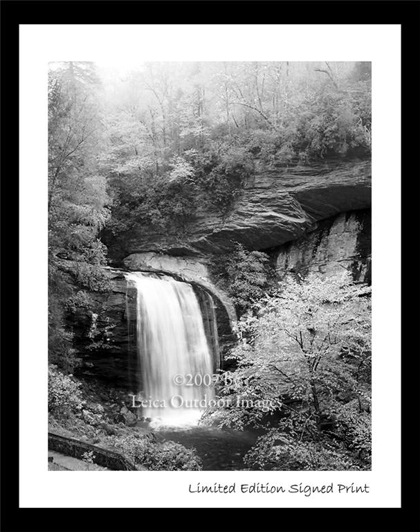
Don't forget to visit my photography web site where we sell museum quality black and white prints framed to last up to 175 years - Outdoor Images Fine Art.

 Colors can be used for any custom marking. I prefer to use color labels to let me know the edit status of the image and if it is ready to print or use in a slide show.